Daily Harvest
Creating a Design System for a Smoothie Company
My Role: PRINCIPAL Design
Daily Harvest
Creating a Design System for a Smoothie Company
My Role: PRINCIPAL Design
Daily Harvest
Creating a Design System for a Smoothie Company
My Role: PRINCIPAL Design
iOS
Android
Web
design system

Overview
Daily Harvest's design system was fragmented, inconsistent, and outdated. Re-platforming Daily Harvest’s app and website to Shopify provided the company with an opportunity to build a stronger and more scalable design system.
The Plan
Audit and Reduce Styles
Organize the UI using Atomic Design Principles
Layout the UI and type using an 8pt Soft Grid
Establish design consistency across all screen sizes and devices
Document the design system and best-practices as a resource for new hires and collaborators


Color
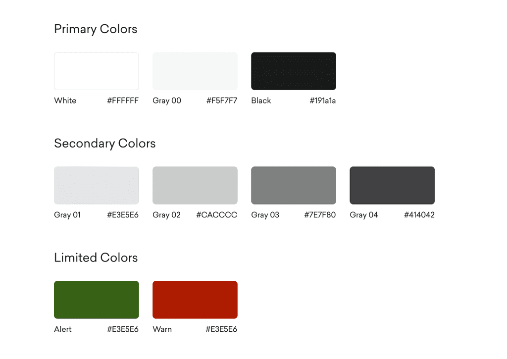
Daily Harvest limits color to photography, so one challenge was creating a grayscale color palette. We reduced the number of styles and assigned each a semantic meaning. We also added two colors to be used sparingly for error messaging.
Color
Daily Harvest limits color to photography, so one challenge was creating a grayscale color palette. We reduced the number of styles and assigned each a semantic meaning. We also added two colors to be used sparingly for error messaging.
Color
Daily Harvest limits color to photography, so one challenge was creating a grayscale color palette. We reduced the number of styles and assigned each a semantic meaning. We also added two colors to be used sparingly for error messaging.

Typography
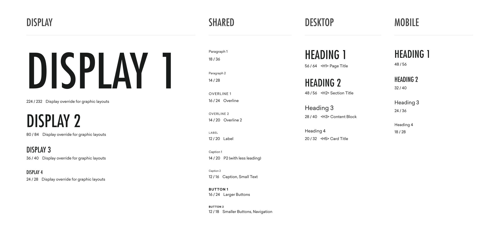
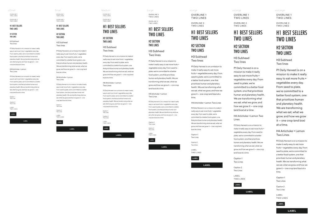
Daily Harvest prioritizes white space within their aesthetic. Their design is at its best when it engenders a sense of calm. This places a lot of importance on type. We simplified their base type styles down to their semantic components and added in display styles for graphic treatments.
Guiding Principles
All line-heights are divisible by 4
Paragraph line-heights are at least 150% of type size
Fixed typographic scale for mobile app dynamic type sizing
Semantic type styles that pair with intended markup


Grids & Spacing
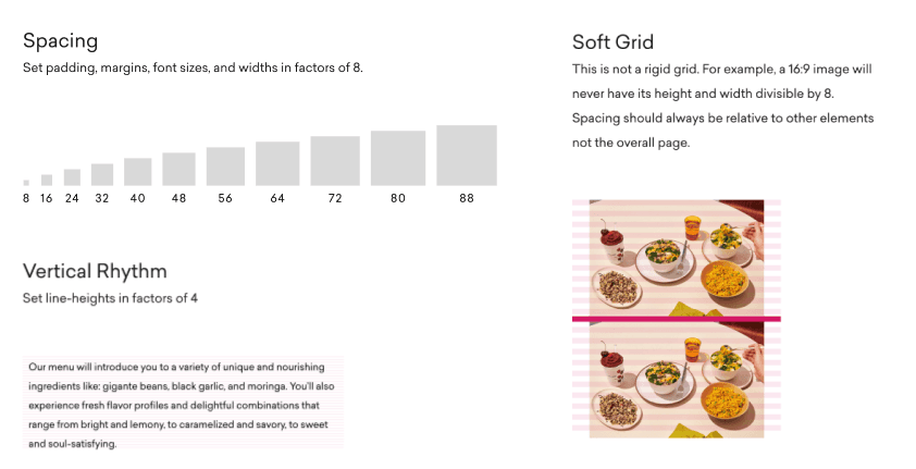
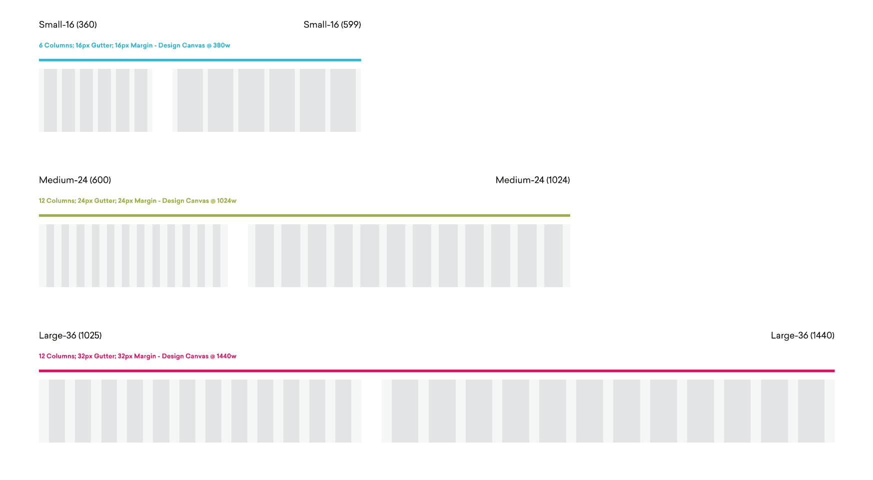
Daily Harvest's platform encompassed both web and mobile, necessitating compatibility across various screen sizes. Initially, there was no unified approach to cross-platform design, with mobile operating under a distinct design system and many breakpoints left to the discretion of front-end engineers. To streamline this, I embraced Material Design standards, which facilitated a consistent system of measurements applicable to both web and mobile interfaces.


Glyphs
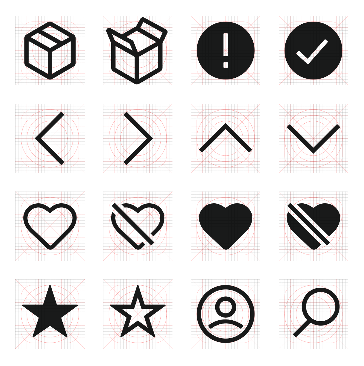
Iconography presented a challenge at Daily Harvest, as multiple designers had previously introduced their own styles. To address this, I re-illustrated the entire icon set, aligning it with a new standard that drew inspiration from the company’s bold typeset
Glyphs
Iconography presented a challenge at Daily Harvest, as multiple designers had previously introduced their own styles. To address this, I re-illustrated the entire icon set, aligning it with a new standard that drew inspiration from the company’s bold typeset
Glyphs
Iconography presented a challenge at Daily Harvest, as multiple designers had previously introduced their own styles. To address this, I re-illustrated the entire icon set, aligning it with a new standard that drew inspiration from the company’s bold typeset



Templates & Components
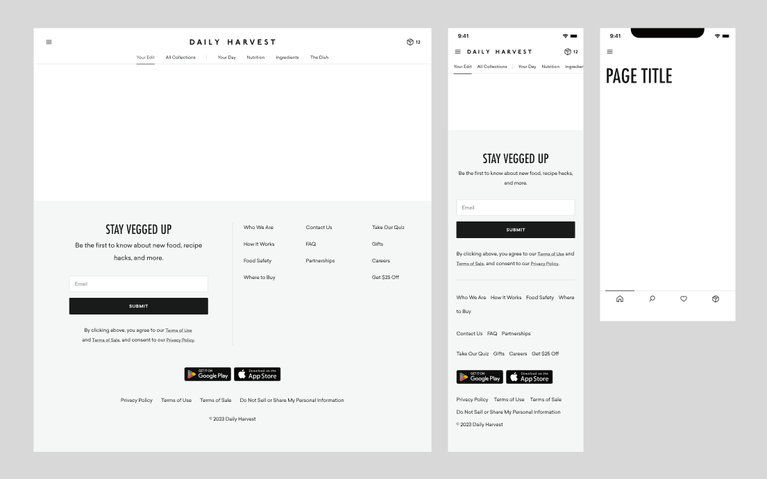
Once the foundational "atoms" of the design system were established, we methodically expanded our library to include "molecules," "organisms," and "templates." We adopted a minimalistic approach at first, avoiding unnecessary complexity and bloat prior to moving into a build phase.


Working with Engineering
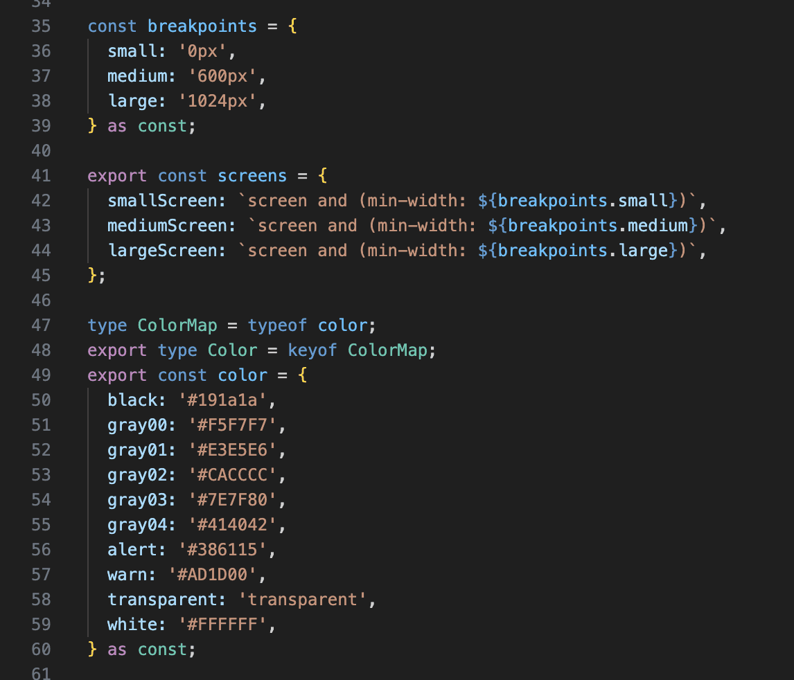
I worked closely with both the mobile and web engineering teams to ensure that our design system was cohesively built in Figma and directly translated into code. The engineers used Storybook to document the components effectively and employed Vanilla Extract to maintain consistency as the source of truth for styling across the project.


Organizational Buy-In
Design systems can indeed fall short if their value isn't recognized across an organization. Shifting the conversation from micromanaging details like "Can you make this type smaller?" to more strategic discussions such as "Are we using the right style here?" is crucial for fostering understanding and buy-in.
To bridge this gap, I conducted regular demo sessions with the founder and key stakeholders during a "Sprint 0." These sessions culminated in a "kitchen sink" demo, where all the styles were showcased together in an easily digestible format. This approach not only highlighted the cohesive aesthetics and functionality of the design system but also demonstrated its strategic importance to the overall user experience and brand consistency.


This site was designed and implemented by me using Framer.
This site was designed and implemented by me using Framer.

